Why Old Maps Put East at the Top

Arts & History Editor
Last updated: August 2026
8 min read
TL;DR
Medieval European world maps usually put east at the top, with Paradise at the upper edge and Jerusalem near the centre, and that habit is why we still say we orient a map. Islamic cartographers such as al-Idrisi often put south at the top instead. North rose with the magnetic compass, portolan charts and printed sea atlases, and hardened into a convention with Mercator's projection. North-up is a useful agreement, not a fact about the world.
Here is a word you have used without inspecting it. When you orient a map, you are literally turning it towards the orient, towards the east. The verb is a fossil of a period when east was the top of the world, and it survived long after the practice it described disappeared.
That is the small pleasure of map history. Nearly every feature of the object in your hand was once a decision somebody argued about, and the winning answers have quietly stopped looking like decisions at all.
The T-O map
The characteristic medieval European world map, the mappa mundi, was not built to help anyone travel. It was built to show how the world was arranged, in the sense a diagram of a cathedral is arranged.
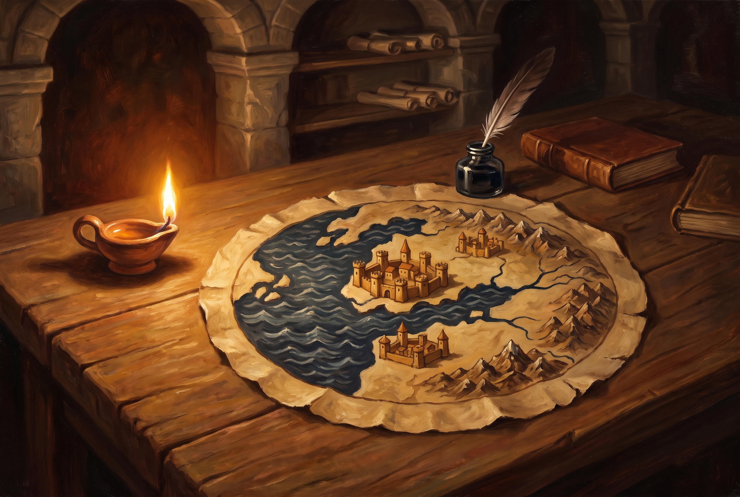
The simplest form is called a T-O map. A circle of ocean encloses the landmass, and inside it a T of water divides three continents: Asia occupying the whole upper half, Europe at the lower left, Africa at the lower right. The horizontal stroke of the T is the Don and Nile, the vertical stroke is the Mediterranean. East sits at the top, and at the very top, beyond Asia, sits the earthly Paradise.
Jerusalem, in many of the elaborate versions, sits at or near the centre. The great Hereford Mappa Mundi from around 1300 is the famous surviving example: a single sheet of vellum crowded with cities, biblical episodes, animals, and a Christ figure presiding over the eastern edge. Reading it as a bad map misses the point entirely. It is a picture of history and salvation with geography as the organising frame.
This is worth holding onto, because the standard story that medieval Europeans thought the earth was flat is simply false, and educated people of the period knew perfectly well it was a sphere. The mappa mundi was a different genre with different aims, not a failed attempt at ours. That confusion sits alongside several other tidy fictions about the era, which I picked through in middle ages myths.
Meanwhile, south at the top
The east-up convention was not universal, and the most striking alternative came from the Islamic world. Cartographers working in the Abbasid tradition and after commonly placed south at the top of the sheet.
The best known is al-Idrisi, who produced a world map and accompanying geography at the Norman court in Palermo around 1154, drawing on Greek sources, Arabic scholarship and traveller reports. Turn his map upside down and a recognisable Mediterranean world appears, well proportioned and rich in place names. Left as drawn, with south upward, it feels alien to a modern eye for no reason other than habit.
Chinese cartography, meanwhile, generally favoured north at the top, and Egyptian and other traditions had their own preferences. There was no global standard because there was no global need for one. A map served the community that made it, and each community had reasons of its own: the direction of prayer, the direction of the sun, the direction the river ran.
How north won
North's rise was practical rather than ideological, and it happened at sea.
- The magnetic compass reached Mediterranean navigation by the late twelfth or thirteenth century, and it gave sailors a reference direction available in cloud and darkness. Once your instrument points one way, drawing charts that agree with it saves constant mental rotation.
- Portolan charts, the working sea charts of the late medieval Mediterranean, were built around compass bearings radiating from wind roses. Practical and increasingly north-oriented, they belonged to a different world from the mappa mundi.
- The recovery of Ptolemy's Geography in Europe in the early fifteenth century brought back a coordinate framework with north at the top, and it carried the authority of antiquity.
- Printing standardised what had been individual manuscripts. A printed atlas is copied identically thousands of times, and copies do not negotiate.
- Mercator's 1569 projection sealed it. Designed so that a constant compass bearing appears as a straight line, it was enormously useful for navigation and it fixed north-up in every subsequent generation of sea charts and schoolroom walls.
Notice that no single decision was made. A tool created a preference, the preference suited an industry, the industry printed at scale, and after two centuries the arrangement had become invisible. That is usually how conventions harden.
The convention and its costs
There is nothing in the physics of a rotating sphere that puts north up. In space there is no up. The choice does real work, though, because whatever sits at the top of a page reads as primary, and whatever sits at the bottom reads as peripheral.
| Tradition | Top of the map | Purpose |
|---|---|---|
| Medieval mappa mundi | East, with Paradise | Religious and historical order of the world |
| Islamic maps, al-Idrisi | South | Scholarly geography and description |
| Portolan charts | Broadly north | Practical coastal navigation by compass |
| Mercator and after | North | Ocean navigation, then general reference |
| South-up novelty maps | South | Making the convention visible again |
The projection question compounds it. Mercator preserves bearings at the cost of area, which is why high-latitude countries look enormous and equatorial ones look modest on the map most of us grew up with. Every flat map distorts something, a trade I unpacked in why every world map is wrong.
Which is a decent argument for reading maps as arguments. A map chooses a centre, an orientation, a projection and a set of names, and each choice is doing rhetorical work whether or not the maker intended it. That is the skill of reading a geopolitical map rather than simply looking at one.
Why the fossil word matters
I like the survival of orient because it is proof that a convention was once a choice. Nobody kept the word deliberately. It stayed because language is lazy, and it now carries evidence of a lost worldview into ordinary sentences about finding your bearings in a new job.
There are hundreds of these fossils, and once you start noticing them the ordinary furniture of life gets considerably more interesting. If you enjoy that shape of question, being handed a historical decision and asked what you would have chosen, you will probably enjoy Turning Points, where the answer is not obvious until you see what actually happened.
North is not up. North is what everyone agreed to draw at the top, until nobody remembered agreeing.
Frequently asked questions
One snap tomorrow morning.
Two minutes in art, history, psychology, philosophy or economics, then the app tells you you're done.
Get MindSnap on iOSFree daily fact, forever. Pro is $9.99/month or $44.99/year.